Passage Elements
Instantly add authentication to any website with Passage custom elements
The Passage Elements are the easiest way to use Passage in your web application. An Element is a modular component that provides a complete UI/UX for modern authentication, embedded directly into your website. The Elements work in any modern frontend framework. Check out our guides to several popular frameworks.
Prerequisites
A Passage account
Setup
Via NPM
Install the Passage-Elements package through NPM:
npm i --save @passageidentity/passage-elementsThen import the package in the module where you intend to use the custom element and import the specific element you wish to use.
import '@passageidentity/passage-elements/passage-auth';
import '@passageidentity/passage-elements/passage-login';
import '@passageidentity/passage-elements/passage-register';
import '@passageidentity/passage-elements/passage-profile';
Via CDN
Include the Passage JavaScript library on your website. Add the following line to the same page where you added the custom element above:
<script src="https://cdn.passage.id/passage-elements/v2.x/passage-elements.js" defer></script>You can also specify a minor build of passage-elements by replacing vx.x in the CDN path with the desired version number such as v2.0.x. All CDN builds are auto-updated with any patches.
Using a Passage Element
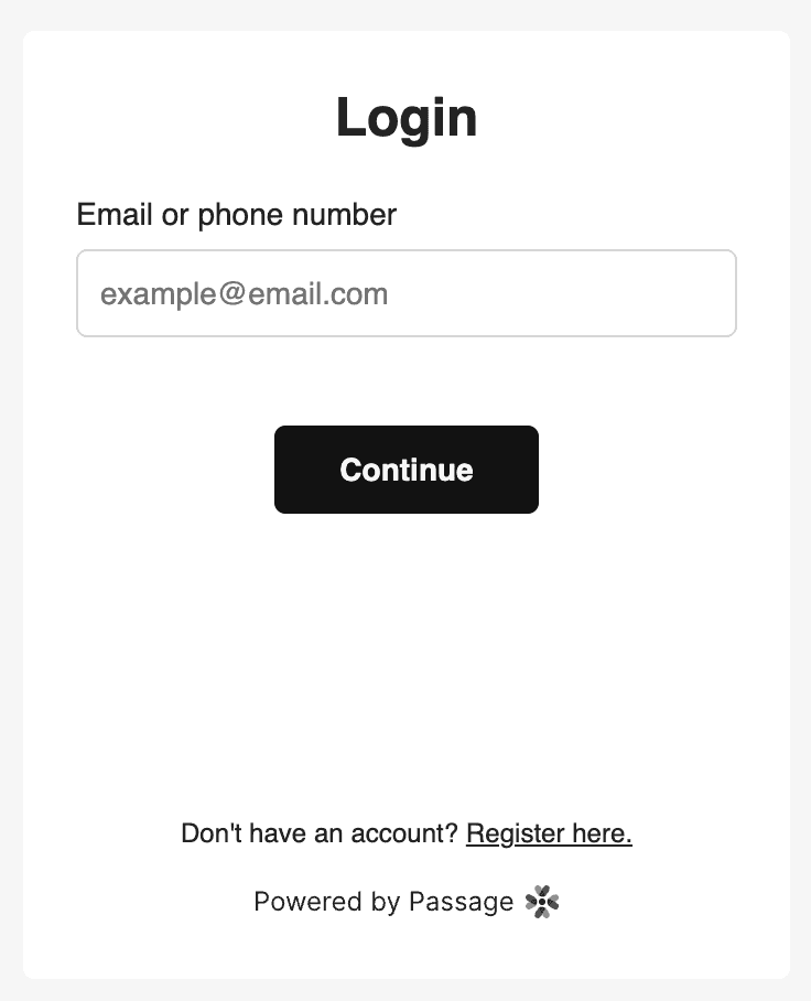
To use the Passage Auth Element, begin by adding the following custom HTML element wherever you want a login and registration prompt to live on your website:
<passage-auth app-id="<PASSAGE_APP_ID>"></passage-auth>Your <PASSAGE_APP_ID>can be located in the Passage Console.
For example, your login page might have the following structure:
<html>
    <head>
        <meta charset="UTF-8" />
        <title>Login to My Website</title>
        ...
        <script src="https://cdn.passage.id/passage-elements/v2.x/passage-elements.js" defer></script>
    </head>
    <body>
        ...
        <passage-auth app-id="<PASSAGE_APP_ID>"></passage-auth>
        ...
    </body>
</html>
Optional Attributes
default-country-code
Used to set the default country when a user enters a phone number.
The value should be a string that represents an ISO country code.
If no value is passed it will default to “us”.
<passage-auth app-id="<PASSAGE_APP_ID>" default-country-code="de"></passage-auth>Passage Branding
By default the “Powered by Passage” branding is applied to the register and login page of the passage-auth element.
If you would like to disable this you may do so in the Console by navigating to Settings —> General —> Passage Branding. After you flip the toggle to off and save your configuration you will not longer see the “Powered by Passage” footer when your element renders.
Styling the Passage Elements
The Passage Elements can be customized using CSS variables. You can modify the default configuration of the Passage Elements to match your site’s look and feel. You can find detailed instructions and examples with the link below.
Styling the Passage ElementsToken Storage
Passage elements support passing in an optional Token Store to customize where the auth token should be stored. Learn more about default client-side token handling and how to customize it at the link below.
Customizing token managementLight and Dark Themes
All five elements - passage-auth, passage-login, passage-register, passage-profile, and passage-passkey-table - support a default light and dark theme, as well as the ability to automatically switch theme based on browser & OS setting. Learn more about using and customizing the light and dark themes at the link below.